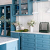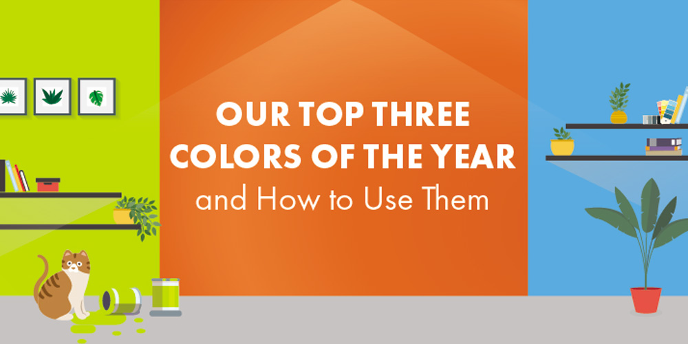
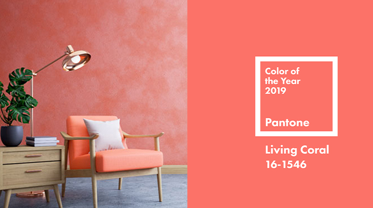
1.BRIGHT: LIVING CORAL
Pantone’s Color of the year: Living Coral 16-1546
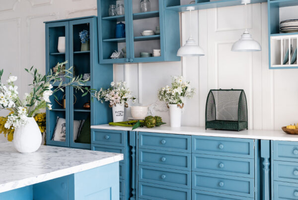
It’s 2019 and designers are losing their minds for Living Coral. A manifestation of this year’s maximalism trend, this anything-but-shy shade is luxuriously full of life. The saturated golden pink packs a punch, so use it to energize: wake up a sleepy entryway, cheer up a dreary bathroom, or brighten a kitchen. Go playful by pairing with teals, tone down with chocolates, or inspire an expensive summer vacation vibe by letting Living Color vamp up an ultra-white monochrome look.
Some Favorite Variations:
Sherwin-Williams: Oleander 6603
This softer shade can work as a neutral, making it easier to bring in the fun warmth of coral without throwing your existing décor out of whack.
Benjamin Moore: Italiano Rose 2087-30
Lively and regal, this red has the retro flare of coral, but with more depth and drama.
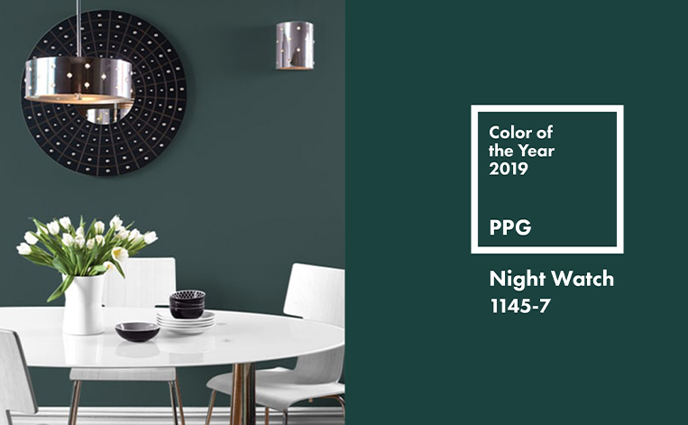
2.DEEP: NIGHT WATCH
PPG’s Color of the Year: Night Watch 1145-7
This dreamy, cool take on the hunter green trend is impressively versatile: use on an accent wall to create depth in a small space, or go big—with its decadent saturation, Night Watch adds moody color without drowning the room. Pair it with soft hazelnuts and beiges to maximize this color’s effortless charisma.
Some Favorite Variations:
- Benjamin Moore: Amazon Moss 2037-10
Paired with black and white, this emerald tone has a 1920s opulence that makes a statement without stealing the show.
- Farrow & Ball: Studio Green 93
This super-dark green is a great alternative to black for elegant accent walls or an edgy trim.
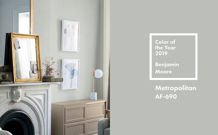
3.NEUTRAL: METROPOLITAN
Benjamin Moore’s Color of the Year: Metropolitan AF-690
This chic grey is a timeless, calm oasis in 2019’s bold trends. Versatile yet original, this cool neutral makes an impression while easily pairing with more saturated tones. Modern yet friendly, Metropolitan provides an approachable glamor that can suit any design aesthetic. Think outside the box: try using Metropolitan as an alternative to white for ceilings, crown molding, and built-in shelves.
Some Favorite Variations:
- Sherwin-Williams: Shiitake 9173
Woody and warm, this grey is an ideal complement for rich greens and blues.
- Behr: Cotton Grey HDC-NT-20
From the Behr Blue Print palette, this linen-fresh grey is cozy and clean.
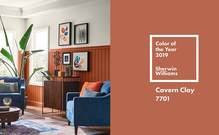
SPECIAL MENTION: CAVERN CLAY
Sherwin-Williams’ Color of the Year: Cavern Clay 7701
Packed with all the pizzaz of Living Coral, the moody charm of Night Watch, and the flexibility of Metropolitan, Cavern Clay is sure to make a lasting mark in the interior design world. The fashionable desert shade is grand yet tasteful. Saturated enough to pop as an accent and neutral enough for wider coverage, it has an adaptability that sparks the imagination. Paired with cooler colors, this delectable earth-tone is breezy, sophisticated, and urban-beachy. Or, lean into Cavern Clay’s warmth by pairing with red and beige for a high-end South Western vibe.