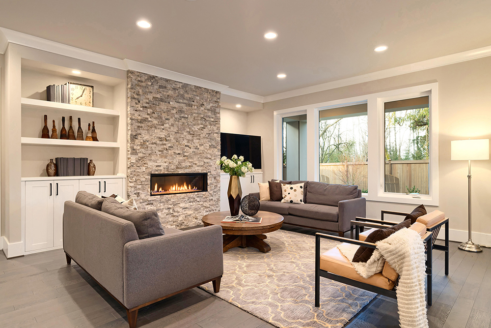
Matching your ceiling and walls can be a challenging project. There are so many colors, so many options, and so many possible combinations. But don’t worry; our expert painters and designers have the answer.
1. Go for a Monochromatic Look
A monochromatic look is a great way to keep things simple. You can use shades of the same colors to give your interior spaces a consistent and harmonious look.
Two slightly different neutrals can create a subtle contrast that isn’t too striking and works well with various furniture, decor, and accent colors.
You could try Benjamin Moore’s “Classic Gray” on the walls and Benjamin Moore’s “Paper White” on the ceiling. Classic Gray has warmer undertones that make your walls inviting, while Paper White will make your ceiling look higher and brighter. They create a timeless and consistent look that matches many furniture and decor colors.
2. Use Complementary Colors
Complementary colors oppose each other on the color wheel, leading to some striking combinations. This strategy is not for the faint of heart, or those that prefer simpler looks that don’t stand out too much.
You could try Benjamin Moore’s “Hale Navy” on walls with “Simply White” on the ceiling. Hale Navy is a deep shade that can make you feel like you’re getting lost in the ocean, while Simply White is a timeless and straightforward shade of white.
Together, they create a bold contrast that can make your ceiling look higher while playing into a coastal theme if your decoration allows it. Some accent colors include gold, brass, and warm wood tones.
3. Opt for Analogous Colors
Analogous colors sit next to each other on the color wheel. This means they can provide a seamless and consistent look that gives the appearance of the walls’ color blending into the ceiling’s. They can create a cohesive combo where the colors enhance each other, providing warm-colored rooms with a cozy look and cool-colored rooms with a calming atmosphere.
For an analogous look, you could try Benjamin Moore’s “Wythe Blue” on walls and “Palladian Blue” on the ceiling.
They’re both a blue-green combination, with Palladian providing a touch of gray and Whyte leaning into muted aqua or seafoam green. Their combo creates a complementary contrast, can make your ceiling look higher (as lighter tones like Palladian tend to do), and give your room a calm coastal feel.
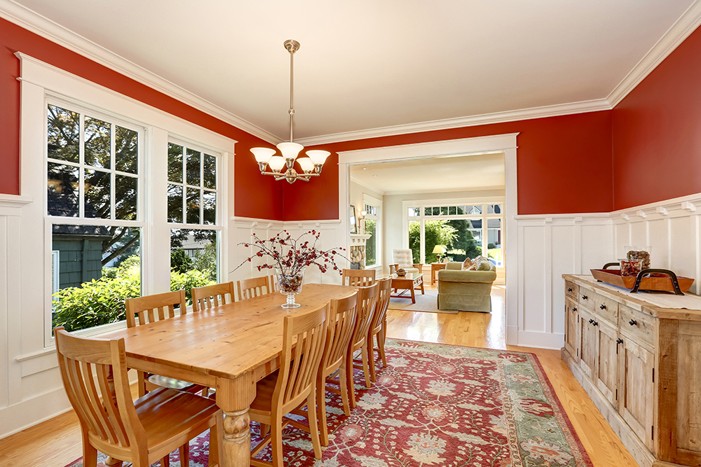
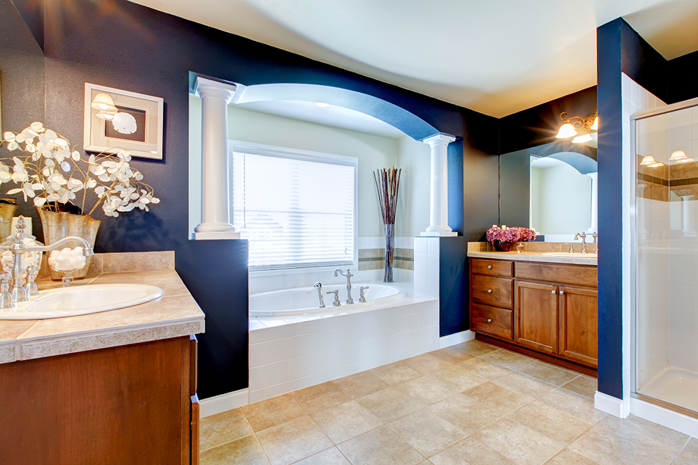
4. Make a Statement with Contrast
Contrasting colors don’t have to oppose each other in the wheel. They just have to look different enough that their combination stands out immediately.
If you want your rooms to pop without using complementary colors, Benjamin Moore’s “Caliente” on walls with “White Dove” on the ceiling is one combination. This combination may seem too bold initially, but it can be a great alternative if you like cozy atmospheres and tall-looking ceilings.
Not only that, but this combination lets you take advantage of your lighter or neutral-colored furniture (should you have any) to balance out Caliente’s intense red, while white accents can tie the room together.
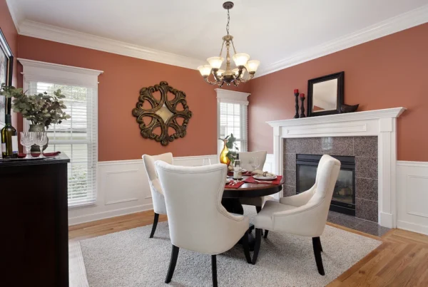
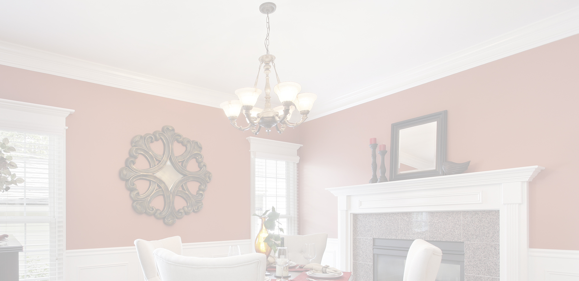
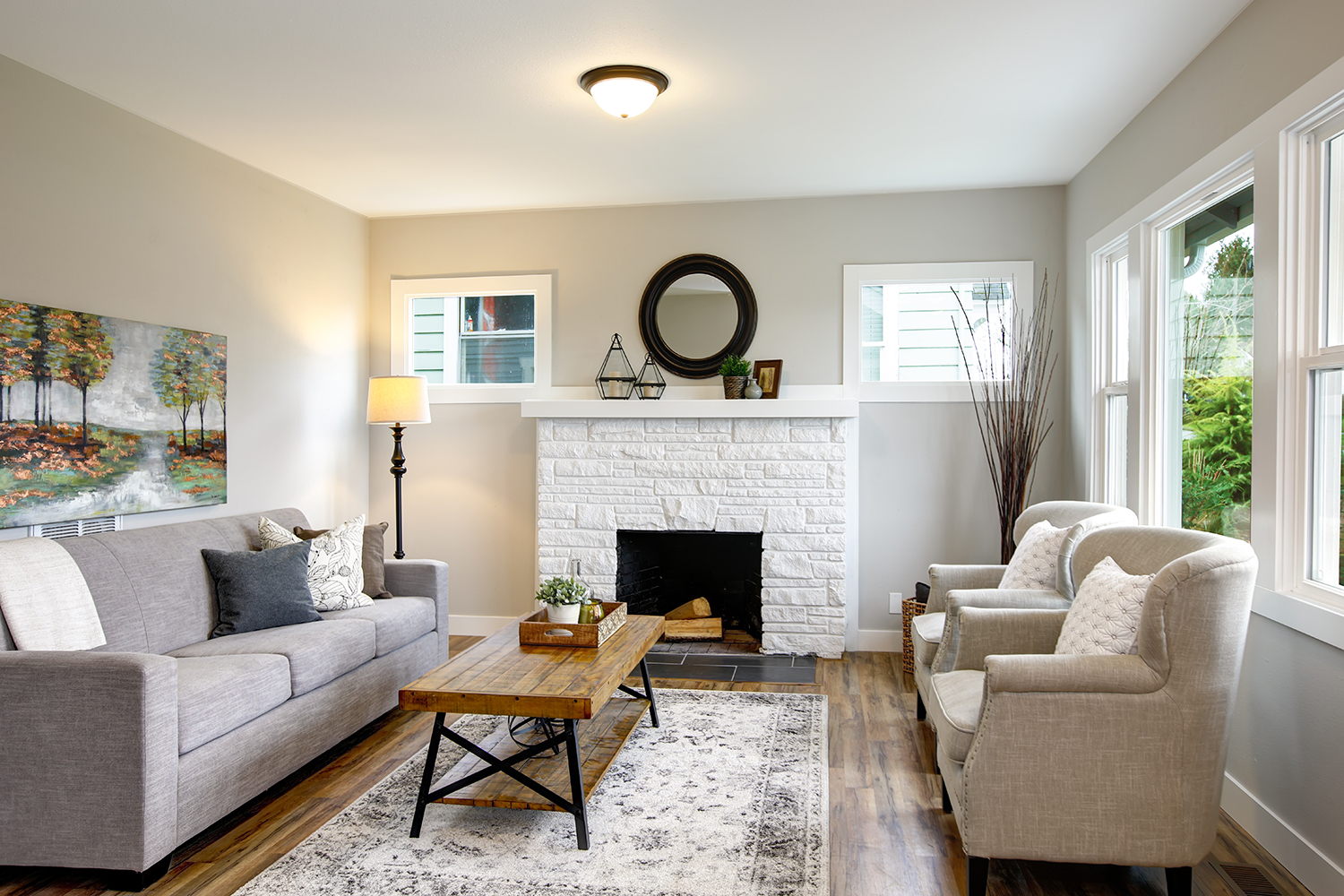
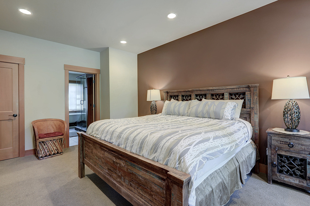
5. Consider the Room’s Function
Before deciding on a color combination, consider the room’s function. You’ll likely want a calming bedroom atmosphere, so go for soothing colors like muted blues and neutrals. While dining rooms look better with rich, deep tones that look intimate and inviting.
For example, in your bedroom, you could try Benjamin Moore’s “Quiet Moments” for the walls, paired with “Moonshine” on the ceiling. Quiet Moments is a serene combination of blue, green, and gray, while Moonshine is a pale and soft gray. They create a calming atmosphere that promotes a good night’s rest.
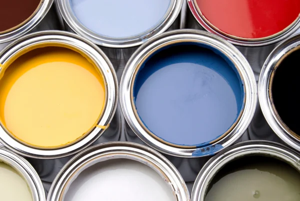
6. Test Before You Commit
Testing the colors before committing to them is the best way to understand whether the combination will look good in your home. For Benjamin Moore paints, there are several ways to test colors:
- Display Chips. Small sample cards, each accurately representing a single color. You can find them in most Benjamin Moore paint stores for free!
- Paint Color Samples. Small paint containers that cover a 2×2 feet, two-coat area. You can use them to paint directly on interior walls (but not on exterior walls) or paint over a white foam board and move it around your home’s inside and outside to test colors.
- Color Swatches. These are 4×8-inch paper samples you can stick to walls with painter’s tape.
- Peel & Stick Samples. You can stick 9×14.75-inch peelable samples to your walls and test different colors and combinations. You can even reuse them on multiple walls!
Top 3 Common Mistakes to Avoid
Don’t fall for these common mistakes when matching ceiling and wall colors.
1. Overwhelming small spaces with dark colors
Dark colors make spaces look smaller, so overusing them in small rooms can make them “shrink” visually even more. Small rooms thrive with colors that make them look airy and open. Use lighter and softer colors in small spaces. Go for light and neutral shades like pale blues, soft grays, and off-white tones.
2. Using too many colors in one room
Using too many colors makes rooms look chaotic and visually overwhelming. Stick to one wall and ceiling color, with up to two accent colors.
3. Not considering the color of the room’s furnishings and accessories
Always consider the color of existing furniture before committing to a color. For example, don’t paint your walls red if you have a green table (unless you plan to move it). The combination has the potential to be too jarring.
Instead, focus on colors that match well. An easy, classic solution for white or neutral furniture is to paint your walls gray. You can paint your walls beige or beige-gray if your furniture is earthy.
Get a Personalized Consultation
Combining colors can be challenging! If you need help determining which color looks best for your space, we offer a Free Color Consultation for each project. When you request a free estimate, ask about meeting a designer, and we’ll do our best to provide you with a personalized consultation to determine which colors work best for your walls and ceiling.